 Road to Version 2
This page is aimed at developers wanting to join us making BasKet Note Pads 2.0. It exposes the vision of the project for everybody to go toward the same direction. It presents the key concepts of the new interface, and prioritize the new features that have been requested by many users.
Searching New Developers for BasKet Note Pads 2.0

Due to being very busy with real life, I'm afraid I have to give up on the development part of BasKet Note Pads. This really hurts me because it is my "baby", but I have no choice: I haven't programmed anything since version 1.0. BasKet Note Pads has no developer anymore. Without new developers, I'm afraid the project will have to be stopped (and unavailable on KDE 4).
The BasKet Usability Project made a lot of positive suggestions, which resulted in an ambitious roadmap for version 2.0 and more.
BasKet Note Pads 2.0 will rock even harder than 1.0: the interface will be refound do be easier to use more efficiently, and it will have tons of new features currently requested by a lot of people.
Thousand of people are already pleased with BasKet Note Pads every days.
Help make those people continue to be happy by developing and setting the next generation of note taking applications.
If you are an interested developer and you know C++ and Qt (or have a strong willing to learn them), then you can send a mail to basket-devel@lists.sourceforge.net.
The Vision about the Project
Whenever you are thinking about a new feature, about a new option, whenever you are wondering how to implement something, remember the following vision and ask yourself if what you are to do fits the project's vision. If not, then abandon the idea (or discuss it on the developer mailing list). This reflection will helps the project to stay coherent.
- It's an application that is unobtrusive:
- Always available, at hand in half a second
- Let you type down notes without any extra effort
- And hide it when you're done, continuing what you were doing before
- Save automatically
- Keep it Simple and Stupid: no unneeded features/options. Doing something should be damned fast, not involving to use deep menu hierarchy or a lot of windows to configure what I want
- No need to create a new text file, pick a name & location for it, open it in an editor, type my idea, save, close the app...
- Very safe (automatic saves, backups, coded as to not provoque data loss) I want to feel as safe as using KWrite to edit a simple text file: it stores my most important data so I don't want a bug in the program to corrupt them.
- It let you collect all sort of notes:
- Text, of course (but rich formatted text with lists, tables...)
- Bullet lists to do outlining
- Draw sketches notes (I always dreamt it but never coded it)
- Record quick notes with microphone (same as above)
- Add images, links, app launchers
- In fact, drop any data and it should be smartly interpreted: drop a KMail email and it show the sender, the subject and the first lines. Clicking that email note should show KMail window with the full mail. Same goes for contacts...
- Collect a large number of such notes
- Allow to be organized:
- WHEN I WANT, I file my previously taken notes
- Even if I'm not organized, I can find back my ideas quickly
Here is my vision since version 0.1. Well, some features were added inbetween, like dropping emails... But the biggest pillars (Keep it Simple and Stupid, very unobtrusive, versatile, safe and organized) didn't changed.
With BasKet Note Pads version 2.0, I would like BasKet Note Pads to be a OneNote for UNIX and Mac OS X.
But also a free quality alternative to OneNote for Windows users.
Available on all platforms also for people using two systems as a daily basis (like Linux at home and Windows at work).
I tested OneNote and find it very easy and efficient to use, while it has some serious drawbacks. Drawbacks are:
- Free-positioning of notes lead to disordered notes. BasKet Note Pads has automatic layout using columns;
- No clear note separation make all ideas looks like if they were merged;
- It has a lot of toolbar items and concepts, it is confusing: it is only a note taking application, after all, not a NASA shuttle dashboard!
BasKet Note Pads 2.0 will be an alternative to MS OneNote, but it will be more than that, it will learn from their mistakes and have a simplier user interface.
The Vision for Version 2
Document-Like Interface
As a result of the BasKet Usability Project, the whole interface will change with 2.0. The goal is to remove the ennoying browse & edit modes for a more efficient note taking, to decrease user-perceived note types, and to allow people to use the note taking application like a word-processor, with a few subtle enhancements.
An example: no more need to change between note-browsing and note-editing mode: you will always have a blinking cursror like in any word-processor. You have an idea: just write it down. You want to add a link, no need to create a separate note, the link can be inserted inline in any paragraph, same goes for an image, colors... The basic unit will not be "notes" anymore, but "paragraphs". For instance, to create a To Do list, create a title paragraph, press Enter to create a new line, assign the "To Do" tag to that line, type the To Do item, press enter, and as a new paragraph is created, the "To Do" tag is assigned to that paragraph... This is way simplier than the current interface where you are obliged to end the first item edition, create a new note, edit it, etc. Now, you can use the Up and Down cursor keys to browse between your To Do paragraphs. Move your mouse over a paragraph and an handle will appear at its left: you can move the paragraph above or below. I know: you will miss the note separations. A basket can have dozens of different ideas. How to visually separate them to get more organized if there is no "note" concept anymore? Here comes the note separation. Just press the Insert. key and an horizontal ruler appears so that two ideas are well separated. A note is now all paragraphs, images, links, tables, sound records... that are between two note separators. This is more flexible because an image and a link to the original images were two notes in BasKet Note Pads 1.0. But as they are related, you were obliged to group those two notes to make them appear related. And grouping was quite hard to tackle in 1.0 (drag and drop notes in a group...). Now, this is not necessary anymore as notes are delimited by you, the user, and not by the machine anymore. Here is a mockup of a basket with note delimiters:

Saved Searches
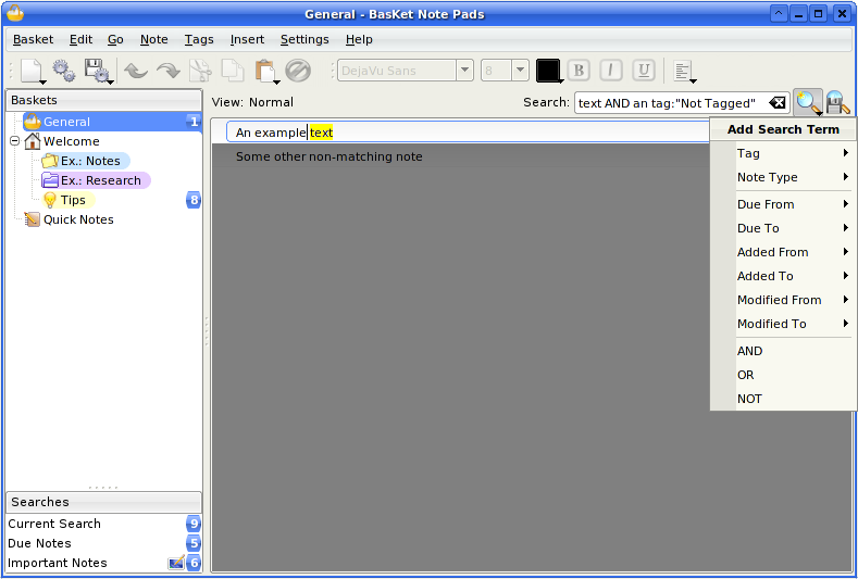
There is also the concept of Saved Searches: you can search for a text, a tag, a date of paragraph modification... All searches are done instantaneously for all baskets at once. Matching terms are yellowed, and unmatching paragraphs are grayed, so you cann see matches within their context. You can also click "Current Search" and see all matching paragraphs from all baskets at once! More importantly, you can save searches, and those searches will always be available. For instance, search for "To Do" paragraphs and save the search. You will always have all To Do items at a glance, so you can read the list every morning to kow what to do today. Even better: such searches could be displayed on the desktop. Tag notes with the tag "Important", save the search for Important notes and display that search on the desktop. You will never miss an important thing again. No more need to browse all baskets in search of important items: they are right on the desktop. Here is a mockup. Keep in mind it was created before the document-like concept, that's why it show gradient-notes instead of paragraphs with note delimiters:

Sections & Pages
The basket hierarchy is good but quite complicated for non-technical users. Moreover, as we tend to add more and more baskets, it becomes quickly full. Adding Sections & Pages concepts will allow to have an easier organization for beginers: they will not use sub-basket but sections and pages instead. Advanced users will still be able to add sub-baskets. And all users will benefit from a cleaner basket hierarchy by creating new sections and pages instead of new sub-baskets. Here is a mockup:

Read more explanation on the usability project "Sections & Pages" page
Note Connectors
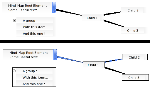
This is a good idea proposed by Frank, of the usability project. The application will have three tools: Pointer, to click and type text; Freehand, to sketch drawings freely; and Arrow, to connect related paragraphs together. This third tool is to do a sort of enhanced mind-mapping. This is optional but helps people to better organize their ideas.

Read more explanation on the usability project "Note Connectors" page

Planned Features
For more information about what features are most requested by users, thus what features to implement first, go to the Planned features page of the usability project. You can also see the Roadmap page I made a few mmonths ago. Most features on that roadmap were also identified to be important by the usability project.
Keep in mind all those new concepts are still in brainstorming on the development mailing-list
Roadmap
There are two scenarios:
If we get enough developers, we can adpot the very ambitious new document-like interface produced by the Usability Project. This is my prefered option and, hopefuly, it will come true. In this case, the roadmap will be:
- Continue brainstorming on the developer mailing list until we reach a pretty complete vision and set of mockups for the whole application;
- In parallel, do Research & Development work: develop a few programs to technically test ideas and figure out how to best architecture version 2;
- Port to Qt 4, just making old things work again of KDE 4 and other platforms;
- Release version 1.5, for KDE 4, Windows and Mac OS X. The next steps will take a long time before completion (perhapse one year or a little more), so we must provide KDE 4 users with something usable as quick as possible;
- Start deep refactorings to support the new document-like interface, notebooks and pages, and a few new features;
- Stabilize and release version 2.0;
- Add every single most-requested features, begining with the most importants. This will give version 2.1, 2.2, etc.
If we do not get enough developers, we cannot aford making deep changes. We will then stay with the current engine, the current code without making refactoring.
- Port to Qt 4;
- Release version 2.0;
- Add every single most-requested features on top of the current architecture (like sound recording, tables, lists, print, addressbook & e-mail intergation...), begining with the most importants. This will give version 2.1, 2.2, etc;
- The new interface is postponed to version 3.0, if we find enough developers by this time.
My Role
Me, Sébastien Laoût, the main developer from the beginning to version 1.0, am now only concentrating on project management.
It is not possible for me to both develop and manage the project on my spare time.
My new role, as a project manager, is to coordinate the team, ensure we are all going toward the same goal, ensuring the application is polished enough...
I will package and release the versions, update the website, and do all those boring tasks for you to concentrate on having fun coding the future of note taking applications.
Of course, as I developed most of version 1.0, I'm competent to help you on some technical parts of the project, or explain what I've developed... You will not be left alone.
